


Improving content discovery across a Meditation App
Content Design Structure
UI Experiements
Consumer App
57%
reduced drop-offs at entry points
1.7x
Increase in Activity Stats, previously 1.2
48%
Total Activity Starts contributed from new banners
Introduction
Level Supermind is a meditation and wellness app. Two of its highest-intent sections Music and Sleep were losing users within seconds of entry. This is the story of what the problem actually was, the design that shipped, and what happened when we tried the same pattern somewhere else.
My Role
Product Designer - strategise, iterate, prototype, ideate, conduct user interviews, high-fidelity design
The Team
1 PM, 1 PD, 2 Frontend Devs (iOS & Android)
Setting the scene
Users opened the app to do one of four things: meditate, sleep, work out, or listen to focus music.Difficulty in finding which content to choose was can trigger frustration and also drop-offs. As wellness is a deeply personal activity, personalization matters the most…
I took on a challenge that had questioned users as well as our content team...how might we lead the user to the content that they actually want to do (and make it feel personalized?)
01
The Problem
The problem wasn't discovery. It was decision friction at the moment of entry

No Clear Starting point for the user
Multiple Sections without structure adding to confusion

Key Insight
55% of the starts came from this section
Static Recommended For You Section
Users opened Music with intent. Between the entry moment and pressing play, they were being asked to choose. Most left before deciding.
38.2%
38.2%
Dropped off
from the first fold
10-15sec
~10 sec
Median time
to Exit the app
55%
55%
of activity Starts came from
Premade Music Playlists
Music Playlists

Excerpts
from user
feedback calls
Excerpts from user feedbackcalls
02
Reimagining content discovery
"If users see one clear thing to start with, the decision takes care of itself."
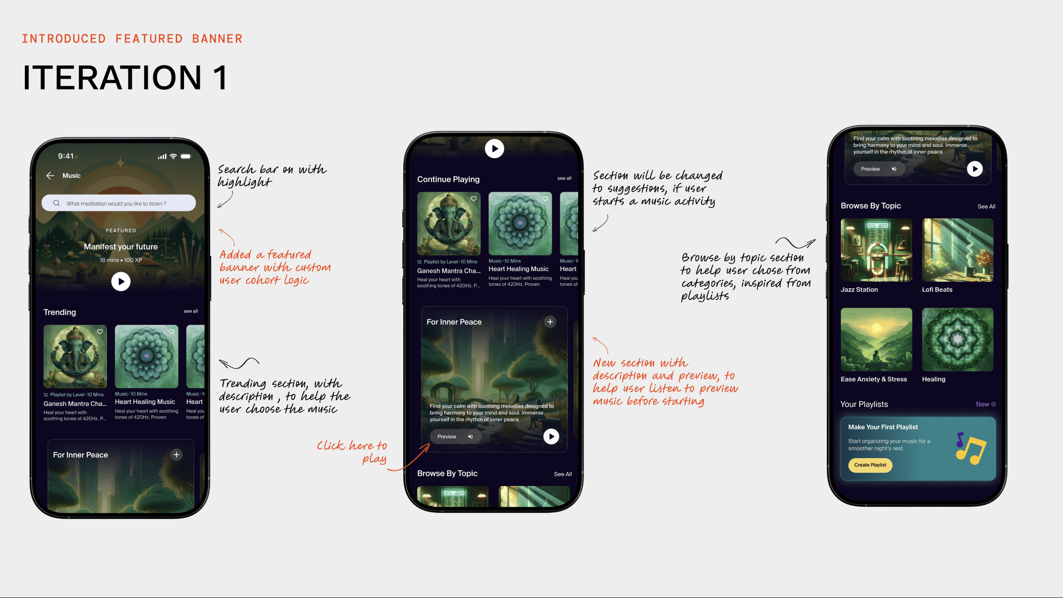


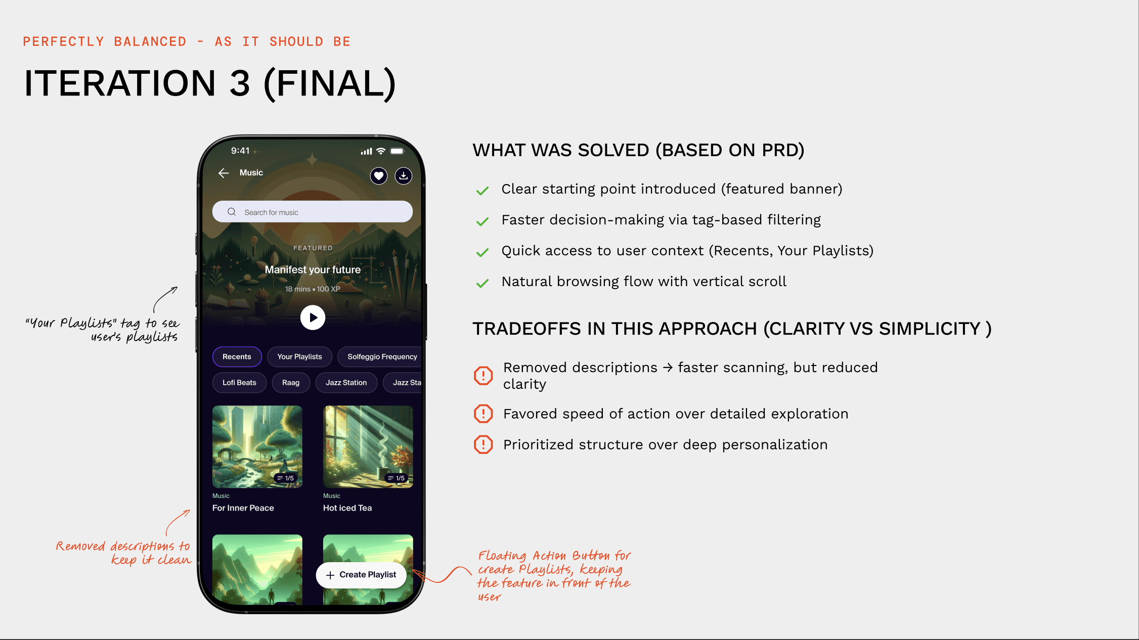
After each iteration, the trad-offs for that approach were discussed and after 3 iterations we landed on something concrete
03
The Solution
Four moves, all pointing at the same idea…give the eye a starting point before asking it to browse.

Featured banner as a clear starting point
This refreshes on each visit, to avoid banner blindness
Infinite scroll
Encouraging natural scroll direction for discovering content
Tags placed above the fold
These were the same "playlists" where 55% of users started the activity
04
Impact
-57%
Drop-off on the Music section 38.2% → 15%
1.7x
Activity starts per user,previously 1.2 meaning users are starting more,and coming back.
48.2%
users started from featured banner!
That was a crazy stat, that led us to beliveve that this pattern of banner + natural scroll was working for our users
What if we applied our learings from the experiments....."
05
The Sleep Problem
42% of users dropped off at the Sleep homepage before opening anything. Same pattern as Music, but the reasons underneath were structural, not visual.

Old IA of the Sleep Section


Research Context (User Calls)
The team spoke to 50 users who'd used the Sleep section at least once. I ran 10 of those calls myself. Talking to user directly help me understand and get new perspectives

My Learnings from the User Calls
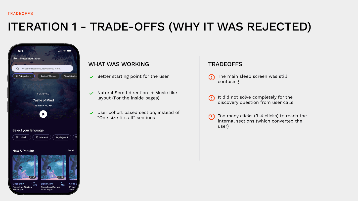
Confusing Tags
Categories like "Moon" and "Nature" didn't map to anything users were actually searching for.
Hidden depth
Most users didn't realise Sleep held three separate content types — stories, guided meditations, and sleep music.
Static recommendations
Recommended for you" showed the same list for every user, from day 1
06
Making it easier to sleep
I restructured the confusing IA, making it easier to start the activity and at the same time surfaced the breadth of content that was present. Following are my iterations, their tradeoffs and what I improved throught them




07
The Solution
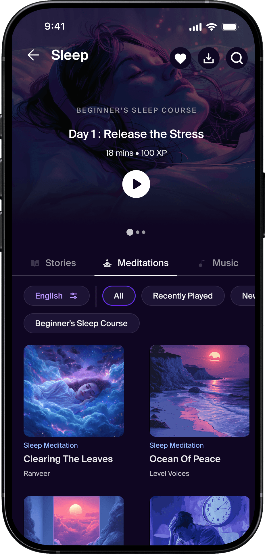
Personalised banner as the starting point. Three tabs surfacing the depth. Cohort-based content ordering below. Continue-playing pulled to the top for returning users.
Featured banner with cohort based logic
New users see beginner content and newly added series
Returning users see next-in-series and continue-playing at the top
Infinite scroll
Encouraging natural scroll direction for discovering content
Sort(Language,Duration) + Category filters
08
Impact
We checked the data with a buffer of 4 - 6 weeks after launch to gather enough data points (as it takes time for actual users to update the app)
-15%
Reduced dropoff from 47% -> 32%
1.6x
Activity starts per
Cross Category Exploration
Increased due to new section
09
My Learnings
Somewhere between the 50 user calls and the third iteration, I stopped trying to help users decide better. The best thing the design did was remove the decision entirely. That lesson held for Music. Then again for Sleep.
Discovery problems are often structure problems.
Users weren't rejecting content. They couldn't reach it.
Personalisation isn't only recommendations.
Continue-playing, recent activity, adaptive ordering small signals did more for the "feels alive" factor than any recommendation engine.
Research drove the direction
Without user calls, we'd have optimised categories. Instead we optimised guidance, progression, and clarity.
Back
This case study is web only available on web for now
Back